
Design basics
What is the difference between vectors and bitmap images?
A bitmap or raster image (e.g. JPEG, PNG, GIF) is made up of thousands of tiny, set-size pixels. This means they cannot be enlarged without “stretching” the set-size pixels and blurring the image. The number of pixels within an image is the “resolution”. The more pixels within the image, the smoother and sharper it looks. If there are too few pixels in the image, it will look blocky and “pixelated”. Bitmap images need to be supplied at a minimum resolution of 300dpi (dots per inch).
Vector graphics (AI, EPS etc) use geometrical shapes such lines, points, paths and shapes (which are all mathematical expressions) to create images. Each point has a defined position on the X and Y axis meaning the file information can be exported and scaled to any size without distortion. When text is converted to outlines, it then goes from bitmap to vector and can be scaled to any size, remaining crisp and smooth. This is why we recommend outlining all text when supplying artwork.
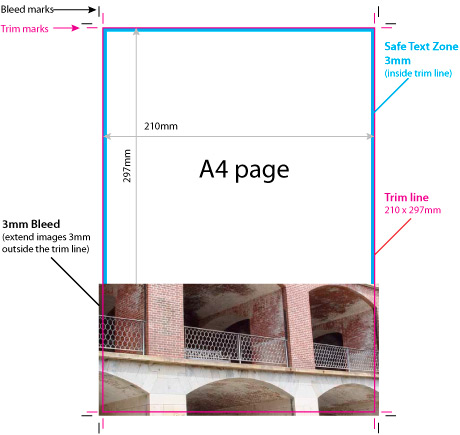
What is trim, bleed and the ‘safe text zone’?
Trim is the border of your artwork specifying where it is to be cut. It defines the final size of the piece. “Trim” and “Crop” are interchangeable terms. Trim lines are represented by a vertical and horizontal hairlines marked on each corner of the page. In layout programs such as Adobe InDesign, when you export your artwork to PDF, a dialogue box asks if you want to include Crop and Bleed marks. Tick both of these then specify how much bleed, in this case 3mm.
Bleed is a printed area that extends beyond the trim. Allowing 3mm bleed guarantees that you won’t see a thin white line if the piece is cut a fraction to the left or right. It is basically and extra 3mm of artwork on all edges to safeguard against shifts when trimming. Layout programs give you the option to include Bleed Marks when exporting PDF’s so we ask that you include these, as well as Crop Marks.
The Safe Text Zone is a 3mm buffer zone within the trim line that ensures important text or graphics are not cut off when the document is trimmed down (see below). Our print registration and finishing equipment is extremely accurate however it is best practice to include 3mm bleed and 3mm safe text buffer.
Why do I need to supply my artwork in CMYK
While computer screens and digital devices display colours in RGB format (Red, Green, Blue), the 4-colour printing process uses CMYK (Cyan, Magenta, Yellow and Black). The range of RGB colour combinations available to view on a screen is much greater than the range that can be printed on paper. As such, if artwork is supplied in RGB format, the printed result will look “duller” and with less contrast than you intended. We always recommend you preview your artwork in CMYK format, then adjust the colour palette as close to your intended output as possible.
Should I use 100% black or Rich Black?
If your design has medium to large areas of solid black, we strongly recommend you use Rich Black to ensure a nice solid result. 100% black tends to wash out in comparison to other CMYK elements in the design.
A good mixture for Rich Black on heavier stock weights is: 50 / 50 / 50 / 100. For lighter stock weights use 30 / 0 / 0 / 100. It is also safe to use Rich Black for text above 7pt+ – our printing is of such high quality that registration issues are not an issue.